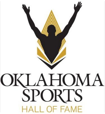
The dated piece of 1980s graphic design nostalgia pictured above is the old logo for the Oklahoma Sports Hall of Fame. Yesterday, the Hall unveiled a new logo as part of a merger with the Jim Thorpe Association.
KFOR's third-grade intern has all the details:
The Oklahoma Sports Hall of Fame announced a new, unified organization, with a new logo to go with it, on Tuesday in Oklahoma City.
The Hall of Fame presents both the Jim Thorpe Award, which goes to college football’s top defensive back, and the Warren Spahn Award, which is presented to baseball’s best left-handed pitcher.
It also runs the actual Oklahoma Sports Hall of Fame on Lincoln Boulevard, and Bright Path Youth Programs, which benefit thousands of children in Oklahoma.
Tuesday’s news conference announced the Hall of Fame will be in charge of presenting and running all of these programs, previously run by the Jim Thorpe Association, in conjunction with the Oklahoma Sports Hall of Fame.
The Hall also unveiled a new logo, showing the silhouette of an athlete raising his arms in victory, with the backdrop of a torch and an arrowhead, representing Oklahoma’s native heritage.
First of all, I think the KFOR intern got a bit confused. The Jim Thorpe Association created the Oklahoma Sports Hall of Fame in the 1980s. Now the Oklahoma Sports Hall of Fame is absorbing the Jim Thorpe Association and the postseason awards it presented. Basically, it's like the Jim Thorpe Association is man, and the Oklahoma Sports Hall of Fame is a bunch of terminators. Simple enough, right?
Anyway, let's check out this new logo:

Yep, nothing says Oklahoma sports like a man being unpleasantly burned in a fire... that's shaped like an arrowhead.
Seriously, how did this happen? Did the agency present three mock ups and have the client chose the bad one? Did they accidentally unveil the wrong logo? Were the proofs sent in braille?
This is just bad on so many levels. For one, you have a man being burned in a fire... or performing the YMCA in a fire... or motioning for a ship to rescue him from the cannibals as he runs from a fire. Two, the logo includes a silhouette. Trust me on this, never put a silhouette in a logo. It's lazy, cliché and will not impress girls when you hand them your business card at the bar.
That being said, I guess the logo could be worse. They could always have thrown a gradient in there or stylized "Hall of Fame" in Comic Sans. Also, at least the fonts are straight and aligned and not pointing in different directions. That's always tacky.


