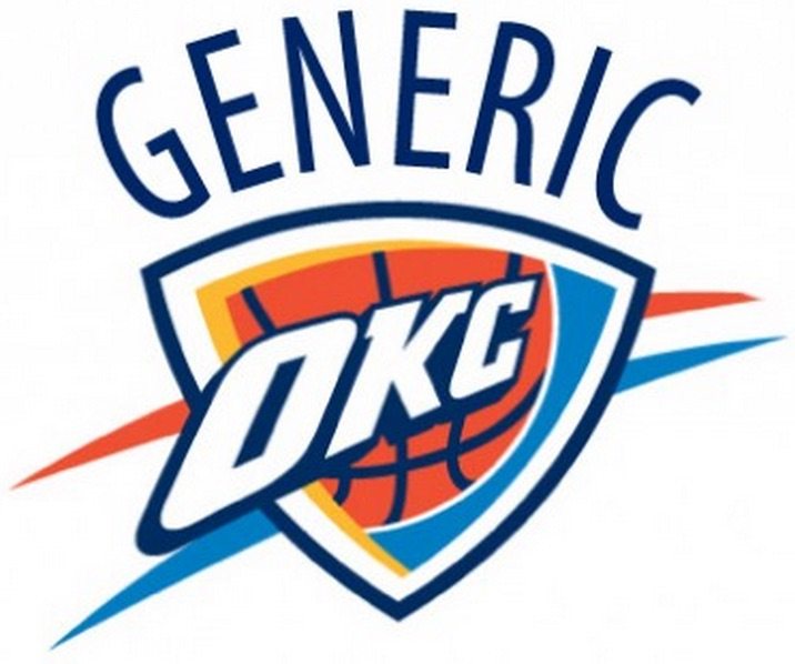
Yesterday, Zach Lowe of Grantland ranked the 30 NBA team logos. The mark of our beloved orange, light blue, dark blue, yellow, and I guess occasionally white Oklahoma City Thunder came in dead last.
Like, what is this? Thunder higher-ups hoped fans would think of two things when they heard the name — storms and rampaging bison — but they didn’t want to commit visually in either direction. A stormy logo might marginalize the bison, a key symbol for local Native Americans, and the staid Thunder thought it would be silly to have mature adults wear jerseys with animals on them. “We didn’t feel like having professional players represented by [an] animal was where we wanted to be,” says Brian Byrnes, the team’s senior vice-president for sales and marketing. Besides, Byrnes says, “the bull was already taken.”
Straddling the fence resulted in this vanilla mishmash. “It might be the best D-League logo ever made,” says Tom O’Grady, who served as the NBA’s first creative director before leaving to found Gameplan Creative, a Chicago-based branding consultancy. Team officials say the shield hints at a leader charging into battle, and that the upward rising “bolts,” which don’t look like bolts at all, symbolize a young franchise growing up.
Wow. Burn. "Best D-League logo ever made?" What did the D-League do to piss off Tom O'Grady?
I'm not very surprised that OKC's logo was ranked dead last. Not to be the guy who liked the band first, but I've always thought the Thunder logo sucked. Actually, screw that. I am going to be that guy. I was actually the first person in the world to not like the Oklahoma City Thunder logo. Well, at least the first person to do so publicly.
Here's the proof:
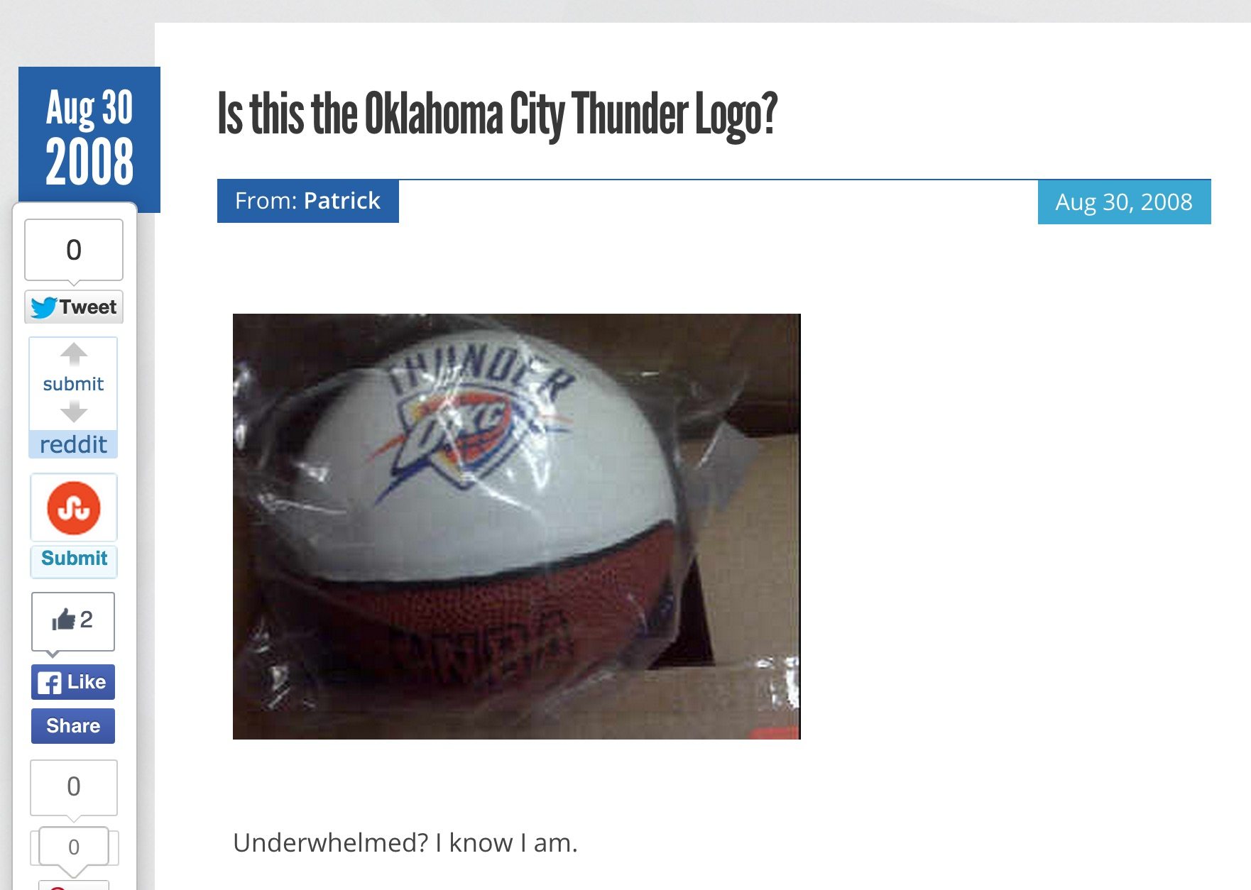
Yep, I'm quite the Internet hot-shot, huh? Not only did I leak the Thunder logo four days before it was unveiled to a very disappointed world, but I also called it "underwhelming." That's brilliant analysis because it's true! OKC fans were expecting something with a bison riding lightning bolts through a multi-vortex maxi grinder while swinging Thor's hammer. Instead we had a five color piece of junk made in Microsoft Word dumped on us.
The good news about the bad logo is that it will likely be changed sometime soon:
No team has worse art, top to bottom, and Nike will push for an overhaul once it replaces Adidas as the league’s apparel partner in 2017. Nike and the Thunder are already talking, and the Thunder “haven’t ruled out” a more explicit weather-related secondary mark, Byrnes says.
Bad news: Oklahoma City seems locked into the shield motif and likely won’t replace it with a bison — or anything else. “To some extent, we are committed to the idea we have,” Byrnes says. “But we would not dismiss good feedback, particularly from Nike. We’re open to modernizing the logo, but we don’t have an appetite to overhaul it.”
"Noooooo!!!!" That has to be what this girl is thinking right now.
Anyway, I hope Zac Lowe was right and Nike is now working with the Thunder Ministry of Propaganda to design a new logo. I think they should embrace the whole weather angle, add huge lightning bolts to the logo, and use a green, yellow, orange and red color scheme that mimics Doppler radar. In fact, Nike could use their technology to create uniforms that have changing Doppler radar weather patterns that move around like Rorschach's mask in The Watchmen. They could also hire Gary England to replace Rumble. Who wouldn't go for that?