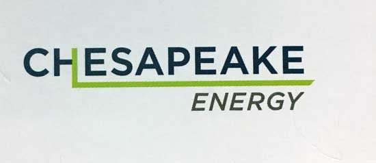
Earlier this week, an Ogle Mole emailed us what they claimed to be a sneak peek of "the new logo for Chesapeake energy!"
Since the company could probably use a makeover and re-brand as it continues to trudge on from the McClendon era – and the logo is just bad enough to be believable – it wouldn't surprise me if it's legit.
Check it out:

Before we continue, let me be clear. I really don't care if Chesapeake Energy has a new logo. This could be fake, or one of several mock ups. I'm just sharing this with you all to be a troublemaker. What can I say! It's fun to irritate big, powerful, secretive corporations.
All that being said, I do have one suggestion. Maybe they should re-think the runaway green line. I get the concept and meaning. The green line shooting out horizontally from the letter "H" represents horizontal drilling, but it's a little too much. The logo is already too long and out of balance, and that just adds to the effect. I'd suggest they do something similar with the last "E," but make the line squiggle like a seismograph trace.
Anyway, I guess we'll wait around and see if and when this becomes official. Now that we've covered and criticized it, they'll probably start over. You're welcome, Chesapeake Energy! I'd like free Thunder tickets, please.


