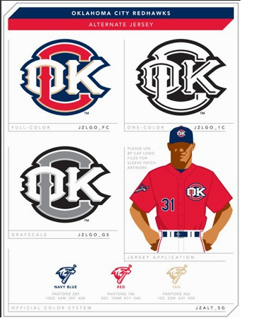
Yeah. I don't know about you, but if I was a professional logo designer living in some other state, I would be moving my family to Oklahoma City pretty damn fast, because apparently we don't know how to design a logo.
Seriously, how could this thing ever happen? When I look at this logo I don't think "Redhawks" or "Oklahoma City" or even "baseball," I just see one thing:
COK
And that's not a good thing to see when your watching America's pastime.
You almost have to wonder if Clay Bennett has some photographs of Redhawks owner Scott Pruitt at a cheap motel with Rowdy the Redhawk, because this piece of COK makes the Thunder logo look like Honeybee Talor skinny dipping in my swimming pool the ocean. I'd rather watch James Hale and Robert Allen share a snowcone than look at this logo.
If the Redhawks were smart, they would say this is all just a big joke and that they are changing the name of the team back to the 89ers. Then they'll say they are bringing back Robo Niner and Abner 89er. They'll also say that every day will be Thirsty Thursday. Then my liver will explode. Maybe that's not a good idea after all, just like putting a big COK on a baseball jersey.
