

Skip to Content
Sports

New OKC Soccer Club Unveils Name, Logo & Gender Reveal Party Branding…

9:19 AM EDT on July 17, 2026

Here at The Lost Ogle, we’ve always been big fans of our local fútbol teams.

Well, at least the ones cool enough to advertise with us!

That’s why, from 2014 through 2021, we were proud supporters of the USL’s Energy FC – attending matches, promoting the team and, most importantly, enthusiastically cashing their advertising checks! It’s also why I’ve been eagerly waiting for our new team to begin playing inside our fancy new taxpayer-funded soccer stadium in 2028!

Well, that new team finally has a name, logo and identity.

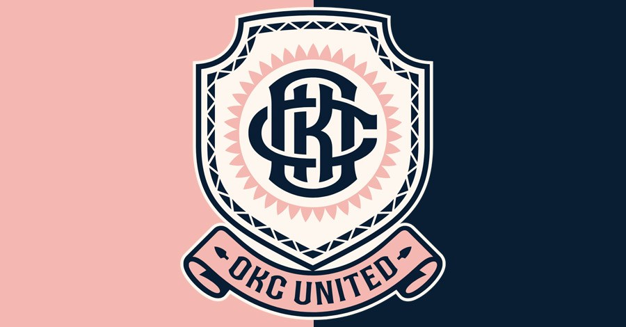
Meet the Fightin’ Blue and Pinks of OKC United. They were officially unveiled Wednesday during Mayor McSelfie’s annual State of the City address:

Here’s the full logo and color swatches:

Honestly, that’s not too bad!

Sure, the color scheme feels like it was ripped from a Canva gender-reveal template, and I don’t know how well blue and pink works for a soccer club trying to win over fans in conservative Middle America, but if the Thunder have taught us anything, Oklahomans will wear just about any logo and color scheme if the team wins!

My two big complaints are…

A) The color scheme will probably be dated in a few years. Then again, considering the average lifespan of a professional OKC soccer team, that shouldn’t be an issue.

B) The interlocking “OKC” is way too messy. It’s like the designer went out of their way to make the letters as illegible as possible. That’s probably because – as the OKC RedHawks once proved – it’s impossible to interlock an O, K and C without everyone seeing “COCK”:

Anyway, the logo was designed by some guy named Matthew Wolff, along with the team’s co-owner and creative director, Russell Westbrook.

Here’s what Russ had to say about it:

“A crest is more than a logo. It’s a mirror,” said Westbrook. “It has to reflect the city, the people and the club all at once, and it has to earn its place on a uniform. Oklahomans are proud and resilient. They don’t need to be told what they’re a part of — they feel it. That’s what this crest is built on. Every element ties back to Oklahoma’s past, present, and future. When you see it, you know it’s OKC.”

Wait a second. If a crest is a mirror, doesn’t that mean everything on it is backwards? Maybe that explains why the “OKC” looks like someone tried to solve a word-search puzzle during an eye exam!

Also, what part of Oklahoma’s proud and resilient past, present and future is represented by midnight blue, sunset pink and ivory cream? The Land Run? The Dust Bowl? A spring wedding at Gaillardia? Can he please specify?

Anyway, while we wait around for Russ to get back to us, you can read more about the team, logo and identity over at News 9.

Stay with The Lost Ogle. We’ll keep you advised.

Stay in touch

Sign up for our free newsletter